4 Things I Make Sure Every Room I Design Has
Some rooms ask for your attention. Others never have to.
1. Texture
Even the most pared-back room needs texture.
It is what keeps a neutral palette from falling flat, and what gives a quiet room its depth. I am always looking for that mix: something soft against something structured, something matte near something with a little sheen, something worn beside something crisp.
A room doesn’t need endless contrast, but it does need variation. Mixing linen, wood tones, plaster, stone, aged metal- that is often where the richness is.
Texture does the emotional work. Especially in a restrained room.
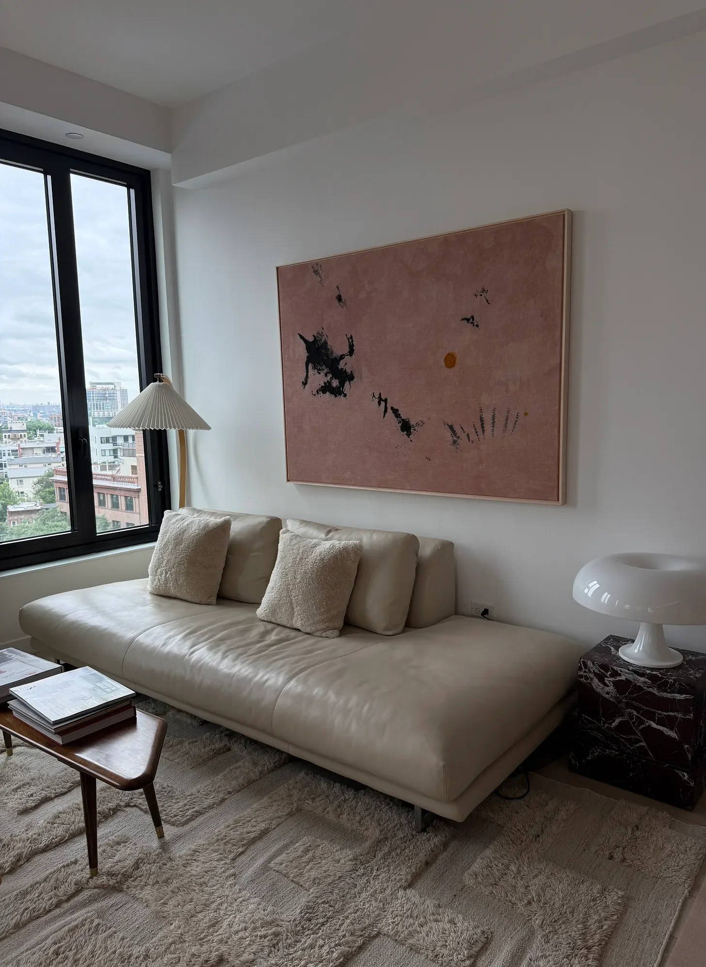
Photo credit: Hallie Rose Design
2. Material repetition
I think repetition is one of the most underrated parts of good design.
When a material appears more than once in a room, everything starts to feel more connected. A wood tone repeated in a chair frame and again in a side table. A brushed metal that shows up on the sconce, then the hardware, then one small object across the room. A linen that echoes in drapery and upholstery. Nothing literal, nothing too matched. Just enough to create rhythm.
It is often the difference between a room feeling collected and a room feeling scattered.
Repetition gives the eye something to trust.
3. Repetition of color creates visual rest
I always want the eye to have somewhere to land.
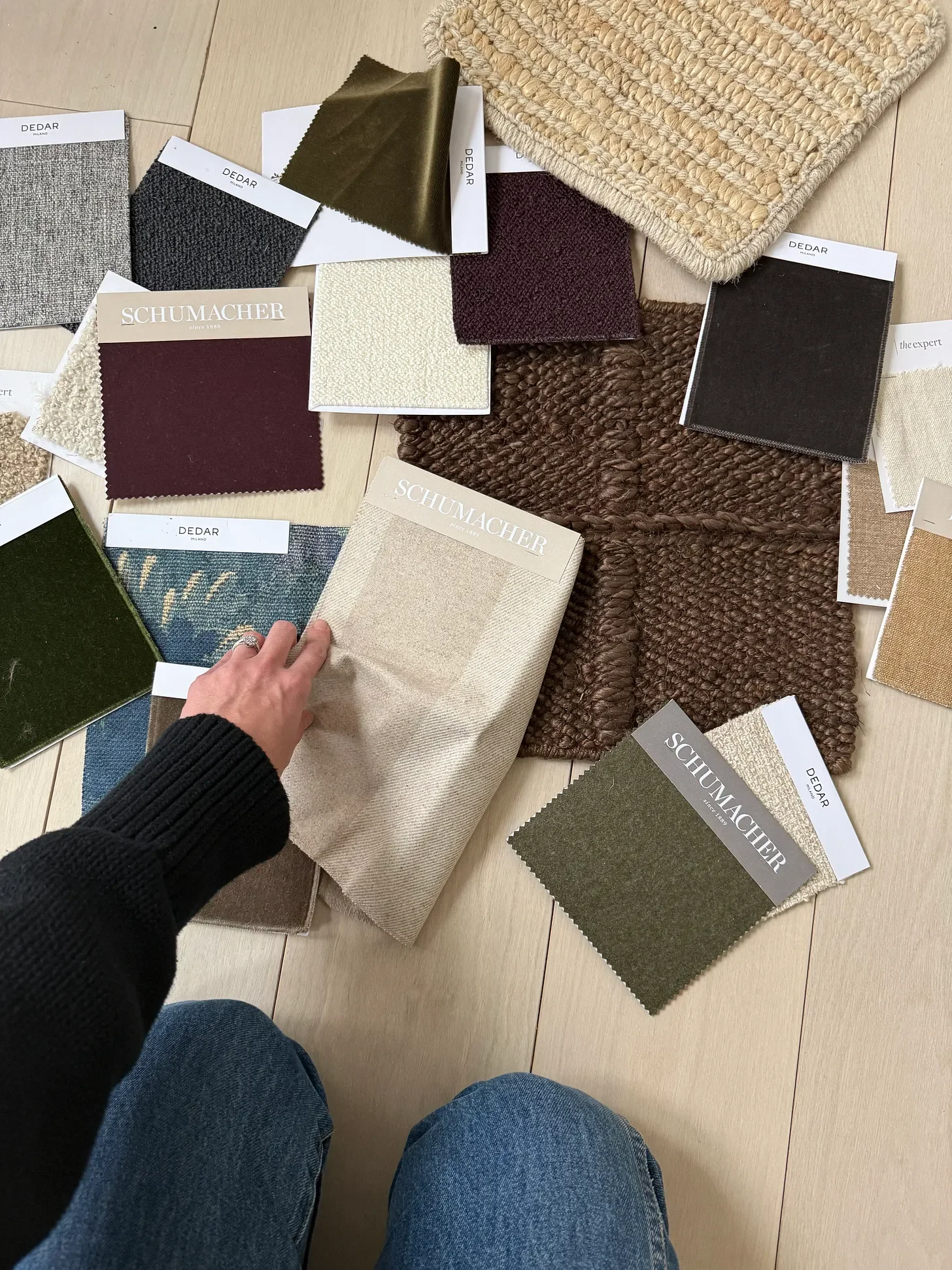
When color is repeated throughout a room, even quietly, it creates visual rest. It allows everything else to breathe. A room with too many one-off moments can start to feel busy very quickly, even if every piece is beautiful on its own.
When one tone returns, the room settles. And once the room settles, the other details start to come forward. The goal isn’t sameness, it’s ease.
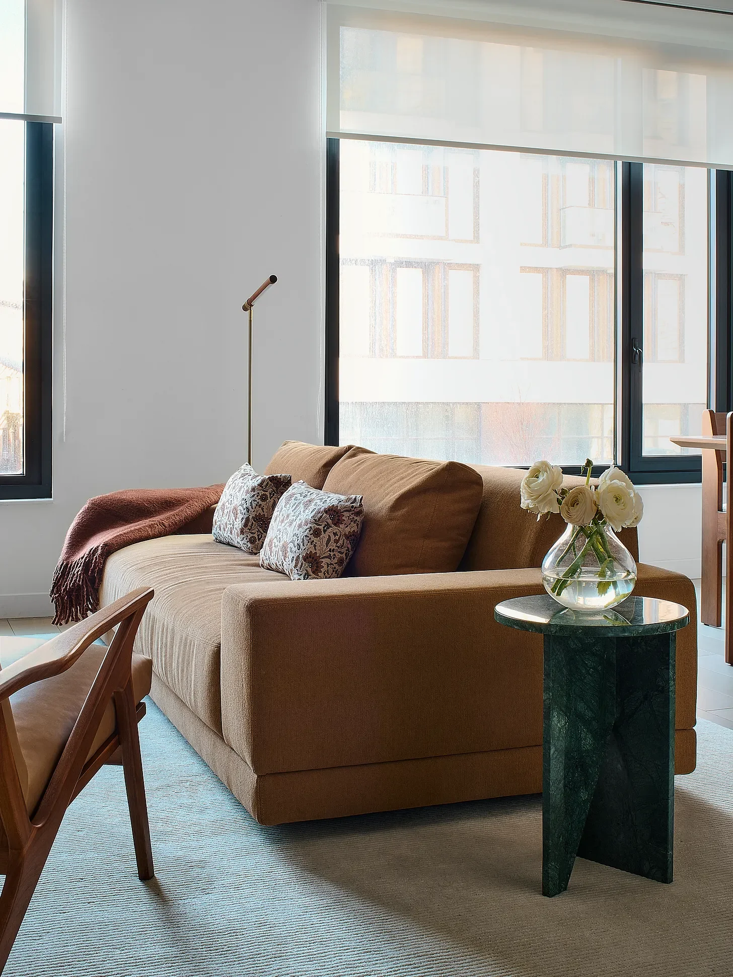
Photo Credit: Hallie Rose Design
4. Harmonious color that is never trendy
I have never been very interested in trend-forward color.
I care much more about whether a color feels right in the room—right with the architecture, right with the light, right at 8 a.m. and still right at 7 p.m. Some colors are loud in theory but flat in practice.
The palettes I come back to most are harmonious, tonal, and slightly complex. Colors with a little dustiness. Something mineral, mossy, chalky, earthy, smoky. The best neutrals always have a point of view.
I look for color that feels lasting, not time-stamped.
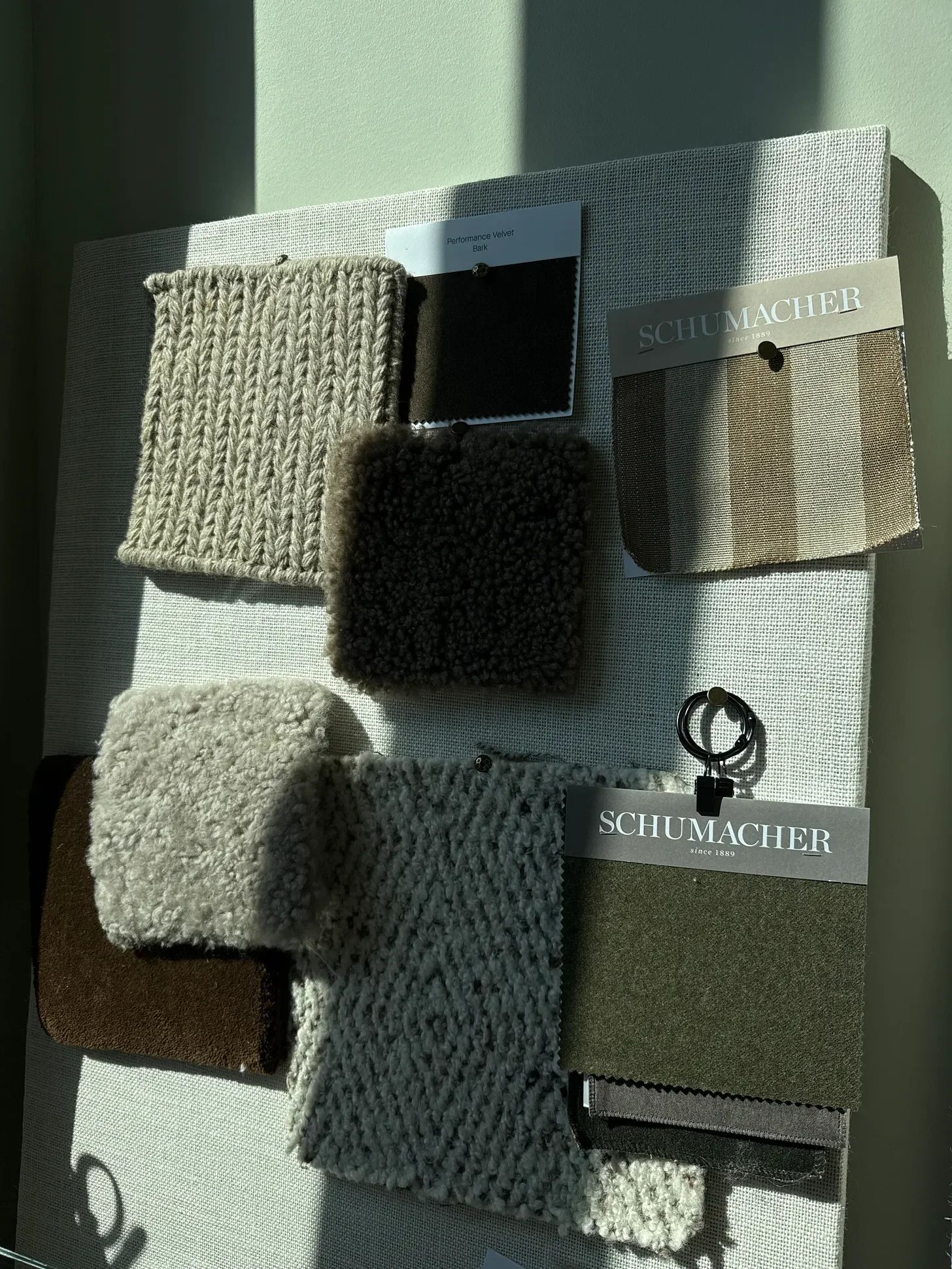
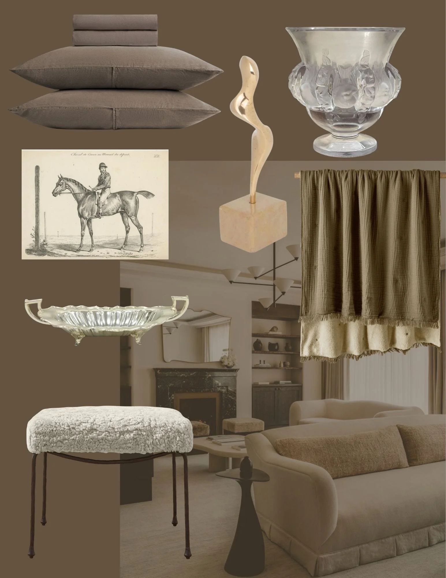
For me, it always comes back to these same quiet ingredients. Here’s a few pieces I sourced below that speak to exactly that.