
Stop Hiding the Column
Most people see a column in the middle of a room and start planning how to cover it up.
Admittedly, I’ve done the same in the past, and spoiler alert: you could still see it. So before I show you what we did instead at our Grand Plaza project, here is where we started.
I had walked by this Richard Meier building for years, hoping to one day be able to design a space inside it. I’m a huge fan of Meier’s work. There is something about the way he uses white, not as a lack of color but as a way to let light do the talking, to let shadow define a room as much as any wall does.
When we finally got the chance, his modernist roots were the starting point. Pure form, clean lines, a simplicity that leaves room for everything else to be the center of attention, most importantly, the life that happens inside of his spaces. It’s quiet architecture, but just as exciting.
Our clients came to us with a young daughter and another on the way. There is something in helping build a home for families that I do not take lightly. They will wake up in these rooms. They will host friends around this table. They will celebrate milestones, right here. That is what makes this work worth doing. I am so grateful to my clients for opening up their home to us.
It’s not lost on me how rare an apartment this generous is in New York City. What makes this one particularly magical is the light and the scale. But like every project, this one wasn’t without its design challenges.
Luckily, I love a good challenge.
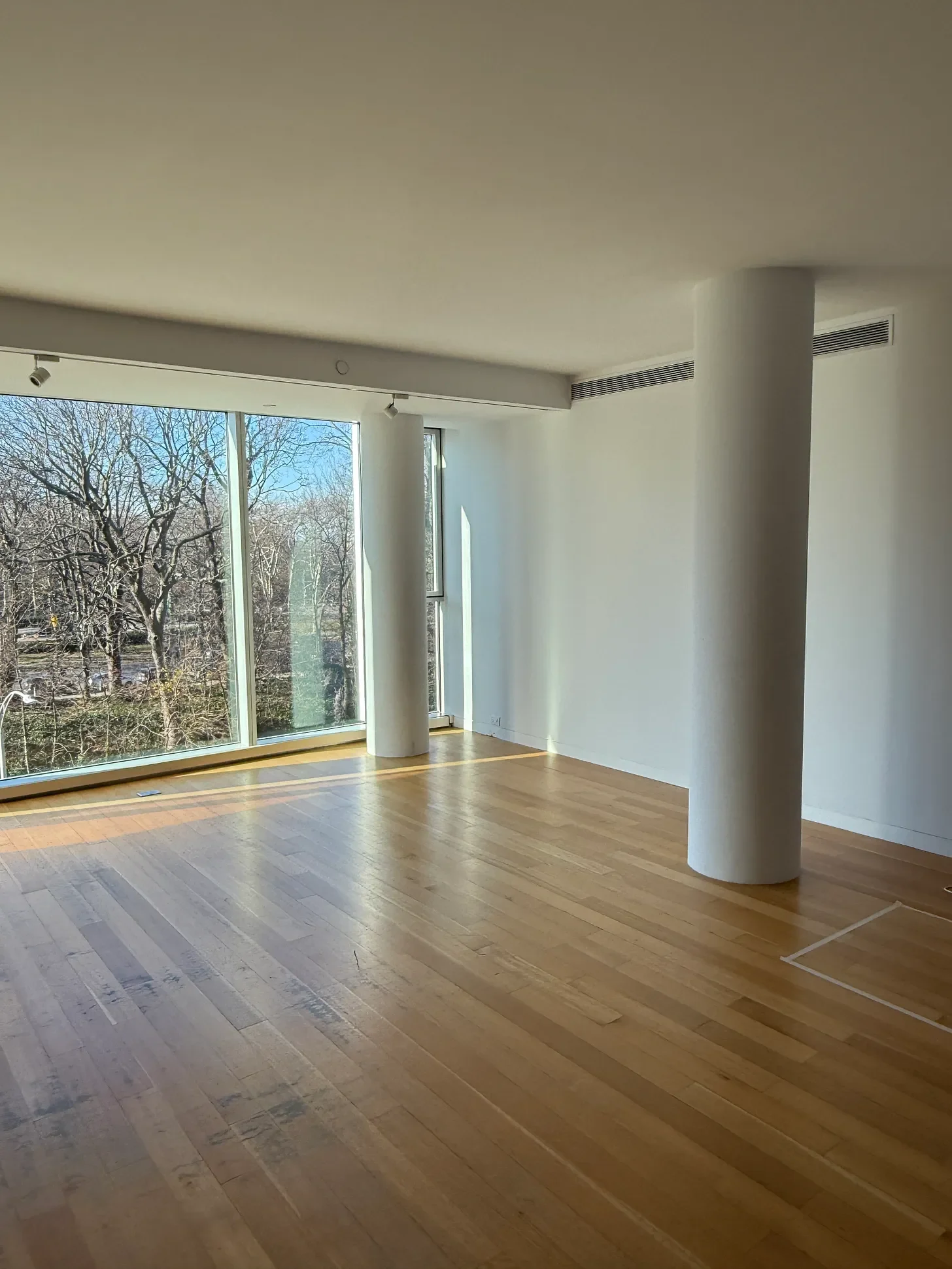
The first walkthrough.
1. Let the constraint set the plan.
Rather than letting it read as one big open floor plan, we used the multiple large columns to break up the room into three distinct rooms: a living room, a dining room, and a kids area. The idea was to have them speak to one another, but each have their own distinct personality. The columns became the guide for where each space began and ended. They became the walls we didn’t need to build.
I love this approach because I find that with open floor plans, furniture tends to float around the room, creating a hodgepodge of dining, living, and kitchen furniture that doesn’t work together at all. The key to creating a harmonious flow in a large space is to define the spaces, whether that be with a rug, art, or furniture. Make sure the furniture doesn’t match exactly, but they should feel like cousins. We achieve this by working with similar types of materials in similar tones, linens or marble for example, and repeating them at least twice across the different spaces.
2. Borrow the shape instead of fighting it.
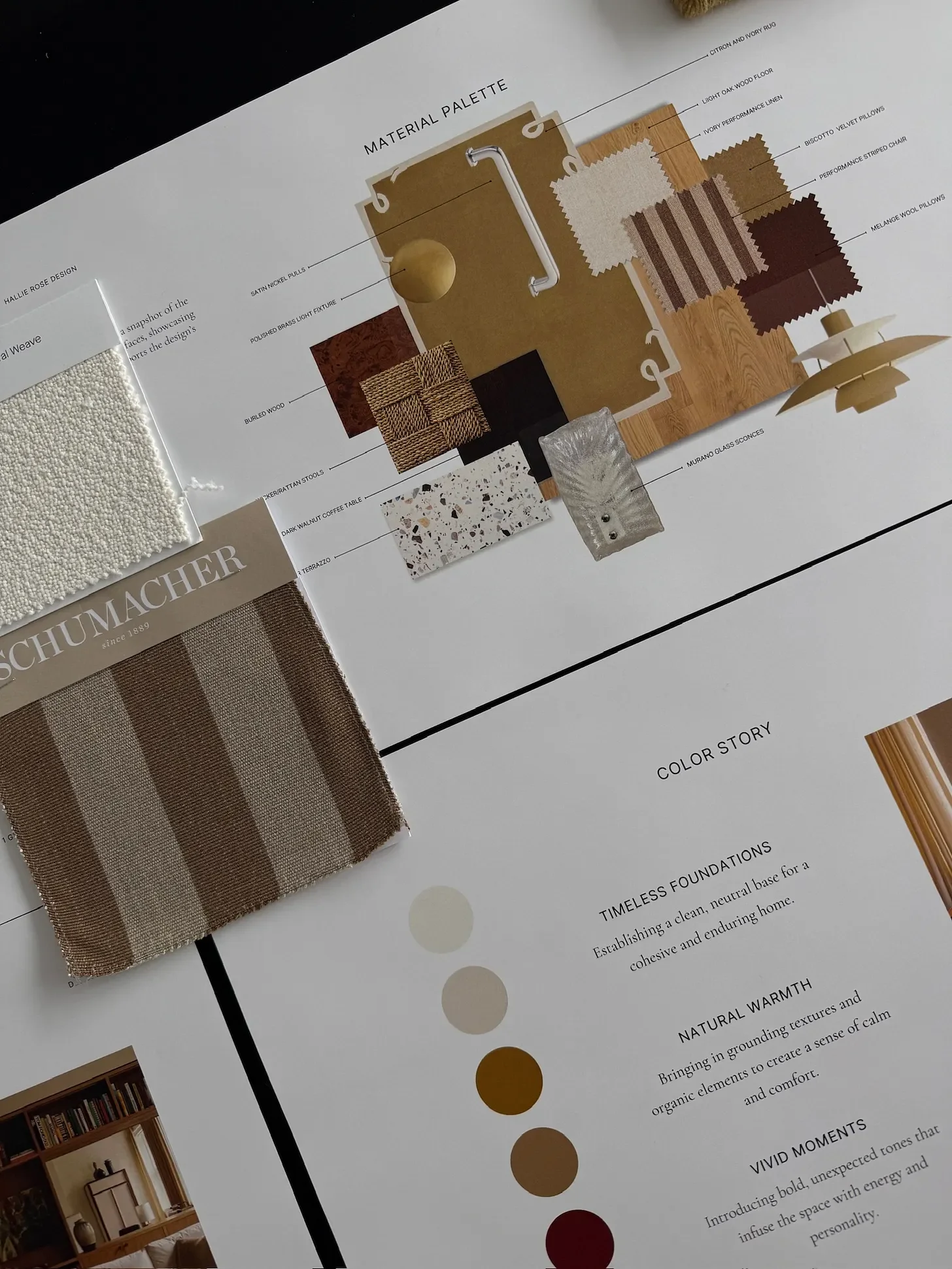
There aren’t too many projects where I would leave the walls a pure white, but for this space, we stayed true to the intent, and used it as a perfect backdrop to infuse unexpected color combinations, mimicking the curved lines of the infamous columns among the furniture and textiles. The architecture had already given us a shape to repeat, so we set out to design furniture that mimicked the curves, to create the effect that the furniture had been there all along
3. Give every zone a real job.
We set out to design plenty of seating, especially for a room of this scale, for our clients’ growing family and love of hosting. When designing a home for a family, we make sure everyone is considered in the main living room. Clients are often surprised by this, expecting us to design a gallery-like space where the children’s toys are banished. But the reality is everyone gravitates to the main living space, so it’s very important that we consider the storage needs in the room we know the kids will be in.
We designed a custom scallop bench with integrated storage and a custom cushion, so it works for kids, for additional seating, and blends seamlessly with the rest of the home.
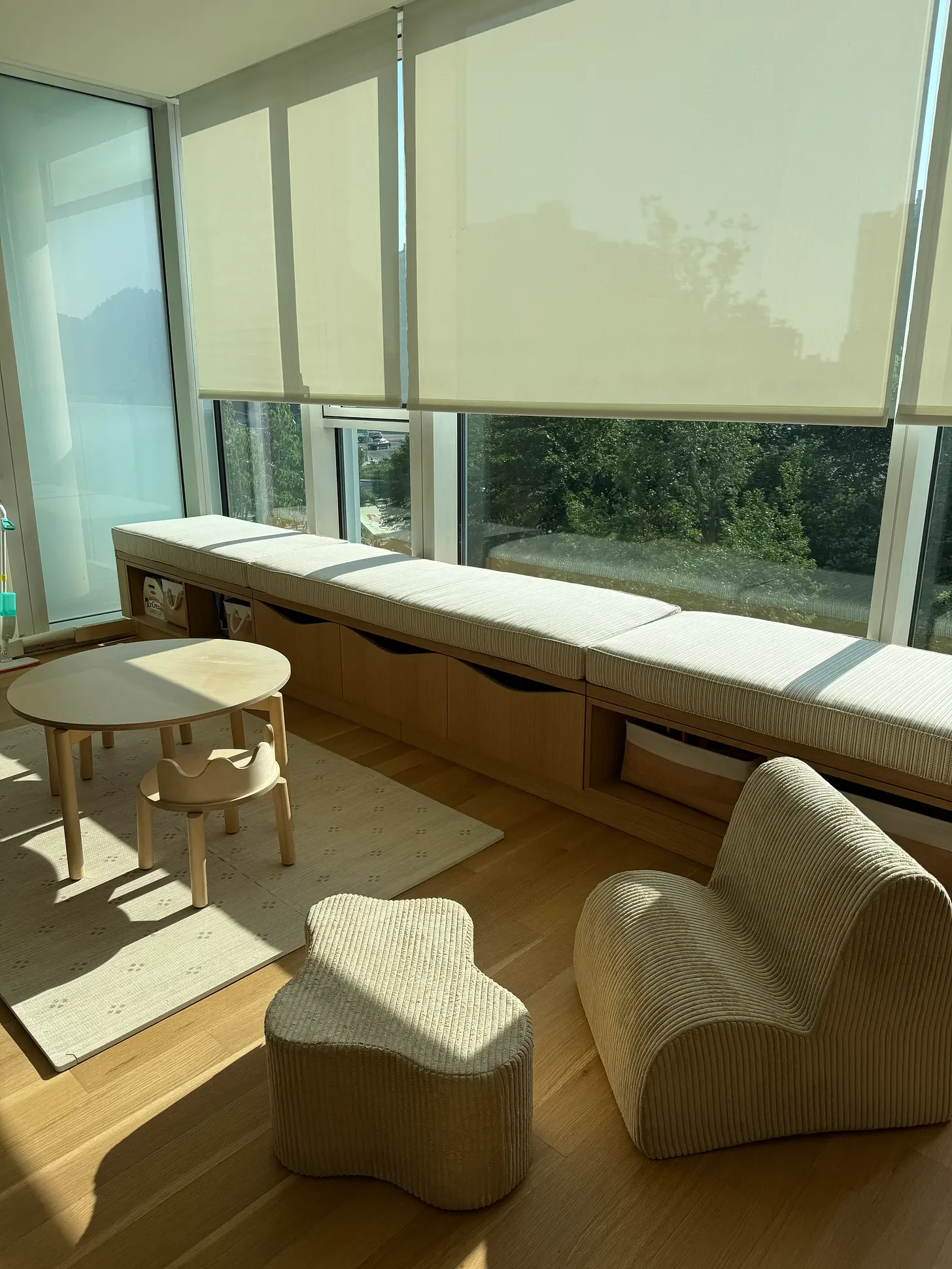
The sweetest little kids corner, and easy to hide it all away after bedtime.
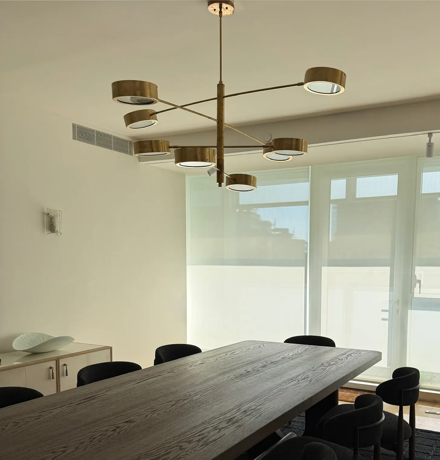
In the dining room, a large walnut table sits with custom upholstered chairs, and vintage lighting always. We sourced an unlacquered brass chandelier, and these French antique Murano glass sconces, flanking the art at the center of the room. It’s one of my favorite moments.
The takeaway
Custom down to the inch. Millwork matched seamlessly to its surroundings. Vintage pieces that look like they have been here forever. Proof that sometimes the biggest transformation is not just about changing the room. It’s working with what’s already there and designing for how a family actually lives.
What is the one thing in your space you have been hiding instead of building around?